OKLAHOMA FOOD ASSESSMENT
Baylor University’s Texas Hunger Initiative, which coordinates efforts to find comprehensive, sustainable solutions to food insecurity, produced an assessment of food resources in Oklahoma. As publication layout and design is one of my favorite types of projects to say yes to, I really enjoyed the opportunity to turn this 70-page assessment, titled “Ending Hunger in Oklahoma,” into a visually attractive and engaging report.
The client had a pre-existing logo and requested that I use the corresponding logo colors of primary red, white, and primary blue. Although I understood why they requested these colors, I suggested that we also add some various hues of these three colors to modernize the look, as well as add in some additional complementary colors throughout for visual variety.
The goal in designing a document this size, verses just exporting a text heavy Word Doc, is to attract the reader, and keep them engaged from beginning to end with the visuals created to guide them through heavy content. The overall intent is to bring them onboard to see change happen through this organization and good, thoughtful design is the way to achieve this.
One of my first steps on most of my projects is create a graphic mood board to present to my clients before fully diving into the design of a project. This helps ensure that we are on the same page, and allows the client to see a preview of elements of the overall design direction I will be creating for them. This process allows us to adjust and edit design elements like typography, icons, photography and layout early, versus seeing it for the first time mid — late in the project.
For this mood board, I laid out the updated color palette, the two font families I thought would pair well together for such a copy heavy report, some stylized icon illustrations, and the photography direction I suggested we use.
I wanted a nice clean san serif for the main body copy that was easy to read and follow, paired with a serif that had character and contract to stand out in pull quotes. This combination would help draw the eye in to important information. I wanted complementary photography that would be engaging and help assist in telling the story of food insecurity in relation to the assessment. This report is all about sustainability and growth; looking at the hard reality of where things are, but knowing change can happen. I wanted the message behind the photos to represent the struggle, the variety of places and people that this topic effects, the hard work, the hope, and in the end the possibility of positive change.
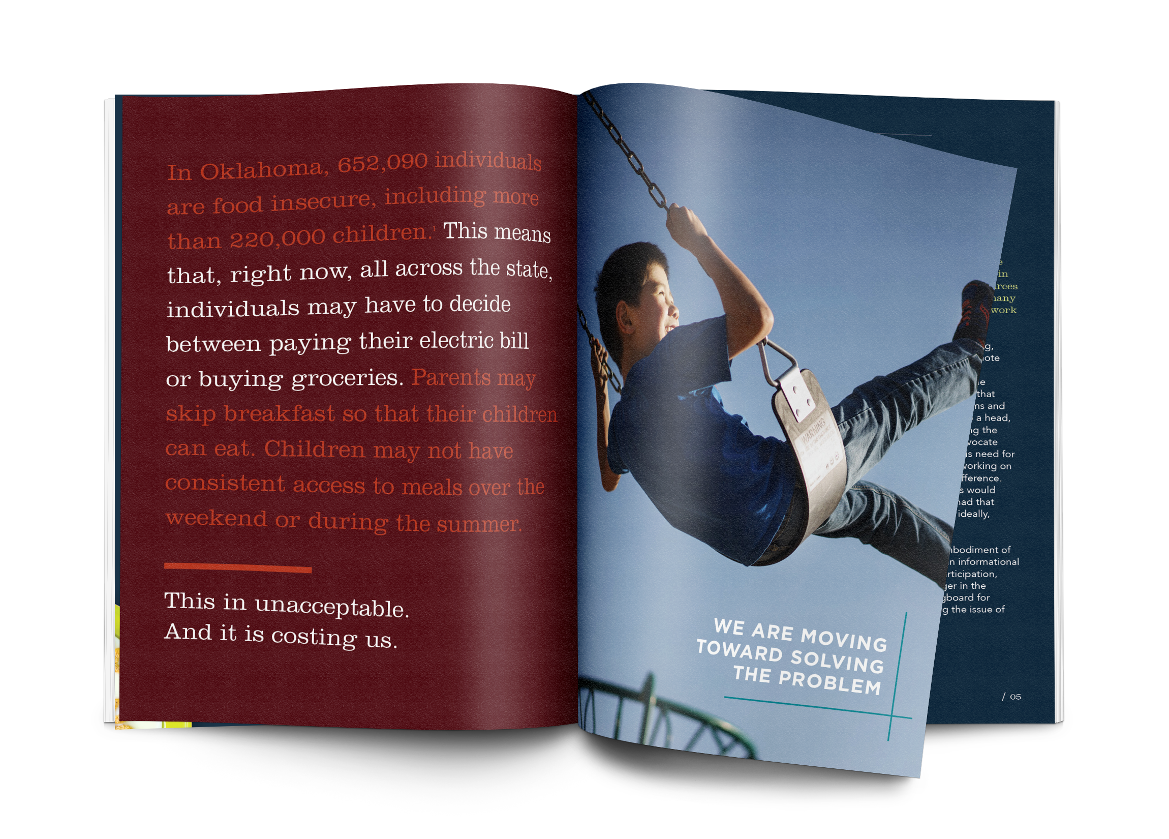
For example, I specifically chose a photo of a smiling boy on a swing, along with the pull quote: “We are moving toward solving the problem” at the beginning of the pamphlet to visually and emotionally engage the reader from the start. I continued this in several places throughout the pamphlet, creating a place of pause where people could connect emotionally to the content, the stats, and the overall impact of the collected information in the report.
Much of the information in the assessment can be disturbing to read, but important for people to conceptualize. As someone who is not a part of this research on a daily basis, I had a fresh eye to focus in on what was engaging and eye-catching to me. Most often, those tidbits and facts were used as pull quotes, illustrated graphics, as well as photography and charts.
This project was a fun and exciting challenge for me as I creatively designed content, statistics and dense facts into a captivating and attractive report, that in turn will be in the hands of people making change happen. It was a privilege to partner with Baylor University’s Texas Hunger Initiative to bring this important information to life.


