On the about section of the Baylor Line Foundation’s website it reads, “Since our founding in 1859, we have believed that every voice is important for a strong Baylor.” I recently got the opportunity to partner with the Baylor Line Foundation to create a whole new layout and design for each of its quarterly magazine issues. Talk about a dream project, seeing as I love publication layout and design.
When the Baylor Line Foundation reached out to me, they explained that they were re-branding their magazine. Much like many magazines today, they wanted to reach a new demographic and connect with recent Baylor University alums. The catch was, they wanted to continue to connect with their established audience and didn’t want a drastic shift that would alienate current readers, staying true to their "voice".
The magazine’s new editor-in-chief had a vision for the magazine. Since it's released four times a year, he wanted to put together a magazine that people could collect—a coffee table magazine, if you will. He wanted something that readers could sit down with and engage with different sections and articles at different times. Then, at the end of a year, they’d have a collection. Whether it’s being read by a current Baylor student or someone who graduated 30 years ago, he wanted the stories—and most importantly for me, the visuals—to resonate. So, to accomplish this cohesive feel and build a product with broad appeal, I started with one of the most foundational pieces of good design, a design element that can be carried across articles and issues—the typography.
They came to me because I have had the opportunity to work on A LOT of publication layouts. I’ve done numerous projects for Baylor and its business school’s publication—the Baylor Business Review, as well as their MBA program. In addition to working with the Baylor School of Social Work, our local zoo, and even some national brands (SimpleBills, Magnolia, The UPS Stores and The HollyFrontier Corporation) this project fit well with what work I’ve done and enjoy doing. I was very excited to help.
If you know me at all, you know one of my favorite parts of a job is creating a mood board. I know it’s not something every graphic designer does, but I think it really helps me, as a designer, have a foundation to work from and also gives my clients something visible and tangible to look at and engage with and know the direction I want to take their project. For theBaylor Line, I created a couple boards, including one entire mood board just of typography.
For me, good typography can stand alone—without color without photography—be engaging and convey a message. Thinking about the Baylor Line Magazine, I wanted to make sure I chose fonts that would be readable and attractive to someone who is 18 and someone who is 80. That meant choosing something that was easy to read and wasn’t too trendy. That ruled out script and really italicized fonts. For body copy, I like to have a serif font and a sans serif font that I can go back and forth between. This provides some variation and helps the body content to be visually engaging and can pull your readers’ eyes forward through the text. One of my go-to type foundries is Hoefler&Co. Not only are their typefaces exceptional (making them a dream to work with), but they are the only type foundry ever to be honored by the National Design Awards at the White House. Also, Hoefler&Co typefaces are in the permanent collections of both the Smithsonian Institution and the Museum of Modern Art in New York. So...yea...exceptional. I chose Verlag and Surveyor as main players in this publication as they’re both clean and classic with attributes that make them timeless and easy to read. (Fun fact: I spent around $1000 on fonts last year just from H&Co.)
Once I had the base typography I was going to use, I could then pull in different typographical elements for specific issues or articles. To get typography just right, I play with it. I adjust things slightly, add a curve or a shadow, make things bold or barely there—it can be time consuming, but once I get it right, it lends itself to making pieces more engaging, more artistic, and can draw people into a project just as much, if not more than a photo can.
:: some samples from both issues ::
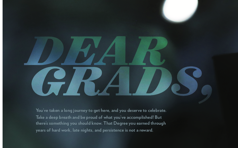
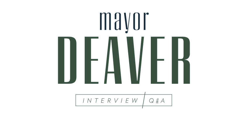
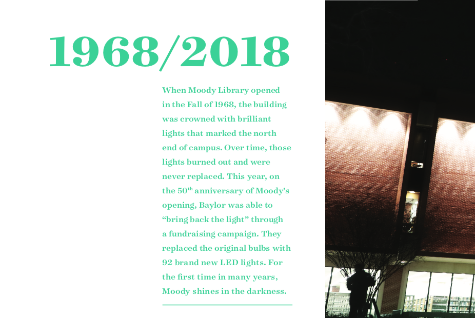
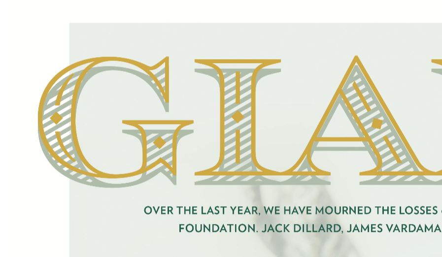
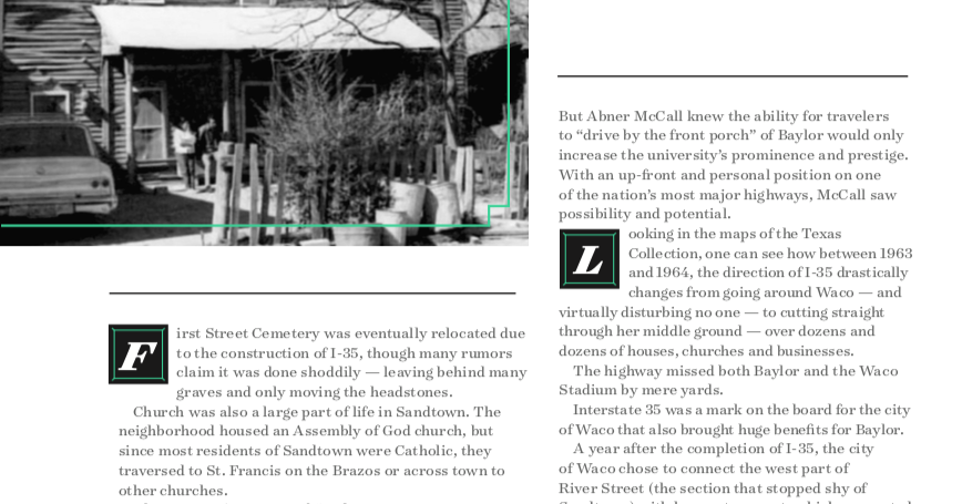
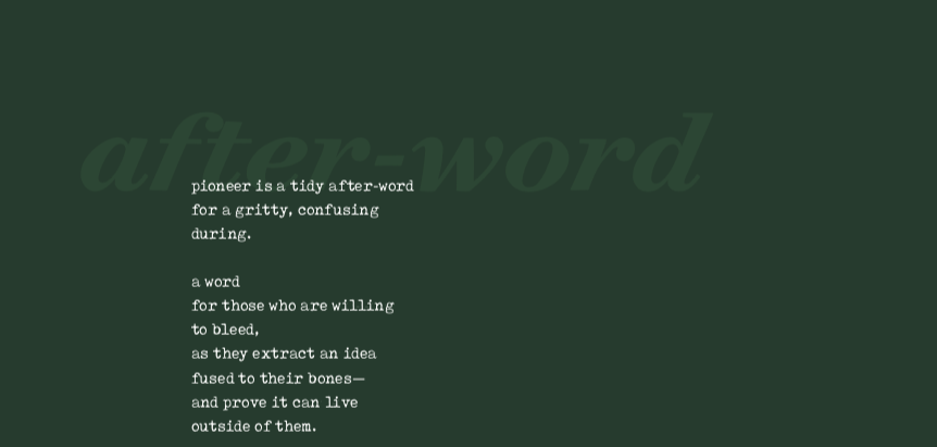
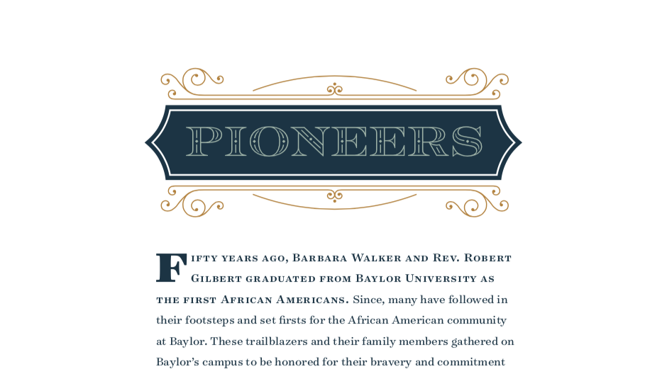
Regardless of the project, typography is an essential part of design—don’t take it for granted or simply settle for what’s easiest. If you take the time and do it well, typography brings words to life, adding a dimension, and conveying a message in itself. When it’s done wrong, you might lose readers before they even read a word.
Learn more about the Baylor Line Foundation and its magazine at https://www.baylorlinefoundation.com/.
Let's make typography shine in your next project, here’s how to get started.

