• WELCOME
  • SERVICES
  • SHOUT OUTS
  • CONTACT

Cedar Gandy

  • WELCOME
  • SERVICES
  • SHOUT OUTS
  • CONTACT

Brand Identity : Emporium Pies


Who doesn't love a great brand?! Im sure each of us have at least 3-5 brands that we admire, enjoy, and don't mind spending our time or money with. We return to that brand over and over because they have somehow built a relationship with us.  It may be through their products, their customer service, or their mission and messaging.  Hopefully it's all of the above.

A brand is more than a logo or a website, it is also your mission, your intention and the value you add to your customer’s experience on a consistent bases.  Heidi Cohen of Riverside Marketing Strategies defines a brand as;

A brand creates emotional bonds with consumers. Brands are composed of intangible elements related to its specific promise, personality, and positioning and tangible components having identifiable representation including logos, graphics, colors and sounds. A brand creates perceived value for consumers through its personality in a way that makes it stand out from other similar products. Its story is intricately intertwined with the public’s perception and consistently provides consumers with a secure sense that they know what they’re paying for. In a world where every individual is also a media entity, your consumers own your brand (as it always was).  

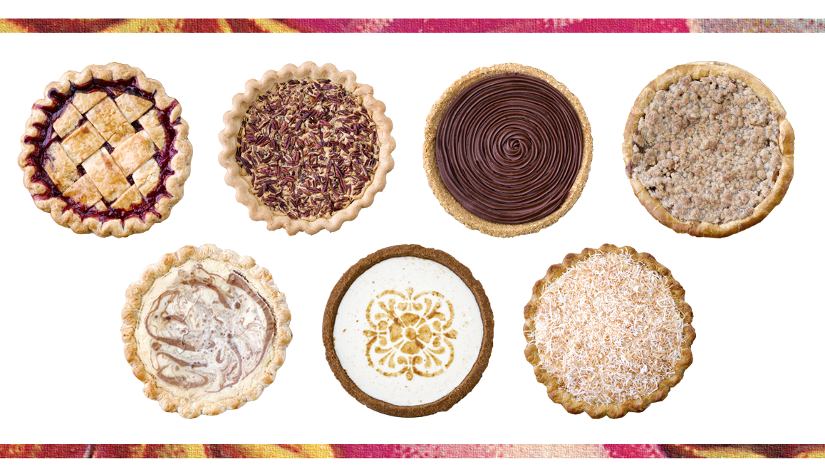
So yes, in regards to brands I wanted to share with you one local brand that I personally think is doing an outstanding job. I recently spent the afternoon in the Bishop Arts District of Dallas with my sister in law, who thankfully took me to Emporium Pies, a local pie shop in that neighborhood. I was very impressed and inspired by their brand through and through. I walked into this little house and was immediately transported to the "good ol' days" when life was simple, but still full of rich relationships and meaningful traditions. Emporium Pies invites you into their brand with every personal touch and well thought out detail of their business from the moment you enter to the moment you depart.

One aspect of their business that stands out {and I love}, is that all of their pies are handmade and all of their menu items change seasonally. Their pies contain no artificial preservatives, hydrogenated oils, dyes, or corn syrup. Now that is attention to detail and it adds value for a lot of their customers {like me}, making the quality of their product a very important part of their brand. 

pressphoto-2.jpg
pressphoto-3.jpg
pressphoto-1.jpg

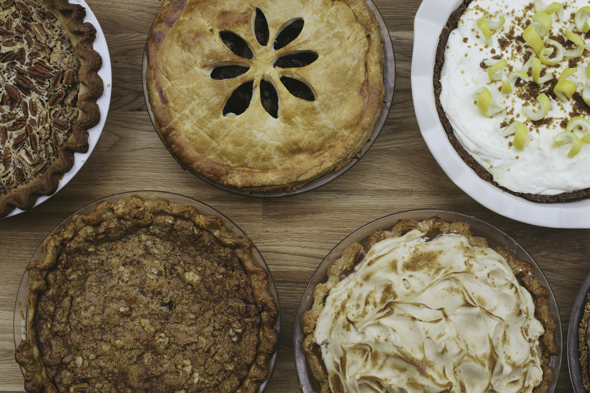
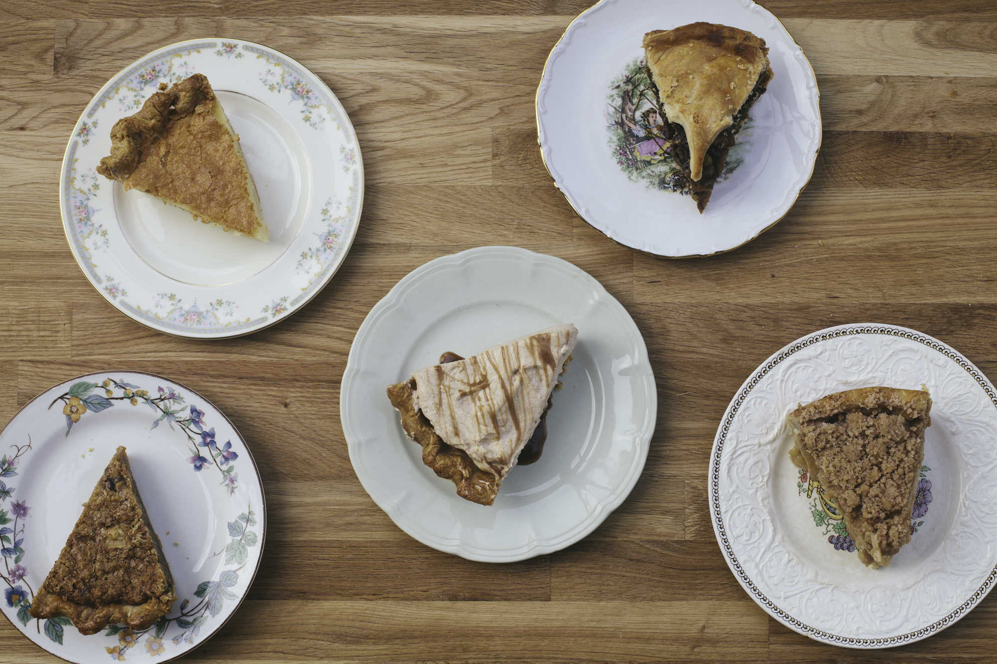
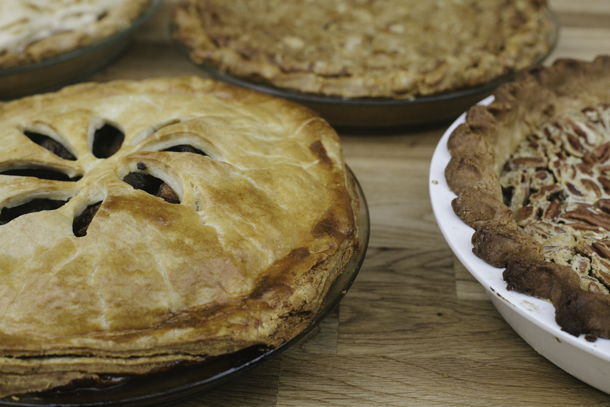
photo credit : Paul Wilkes 

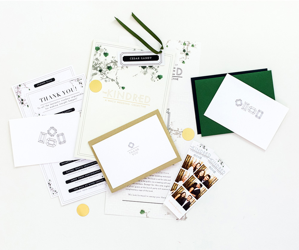
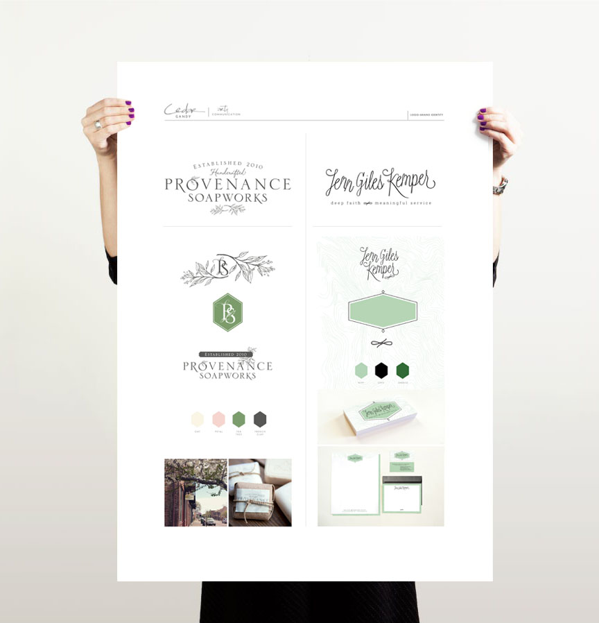
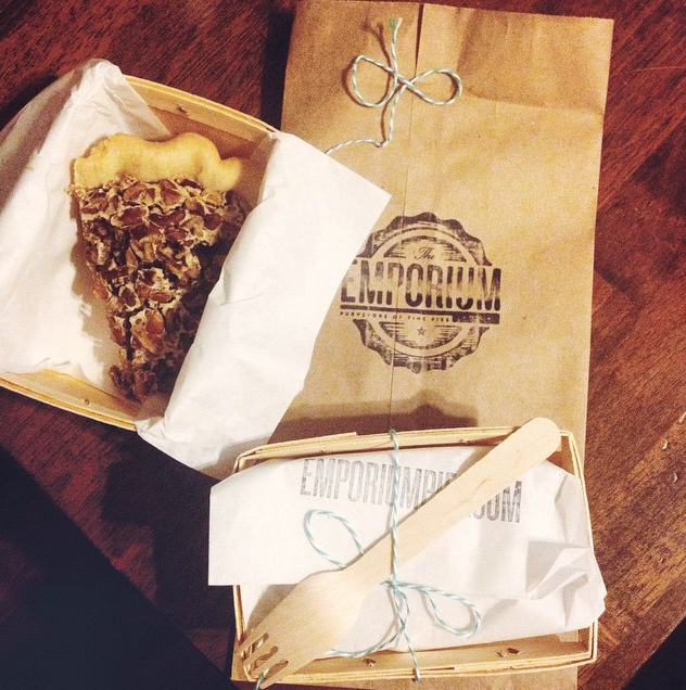
Also, the handmade touches and attention to detail are carried throughout their visual branding as well.  As a graphic designer, one of the first things I noticed was their logo and the paper stock they have their marketing material printed on {Im guessing it's Neenah, pearlized 80# cover}, and they have added gold foiling. Their packaging stands alone and is also put together by hand, one at a time, right in front of you. Each piece is stamped with their logo, tied up with bakers twine, and placed into a woven pie basket. It's pretty special. Their team also has a huge roll to play. The way they greet and serve their customers, along with their cute personal style adds to the overall customer experience and personality of the Emporium Pie brand.

edit3.jpg
IMG_5258.JPG
IMG_5261.JPG

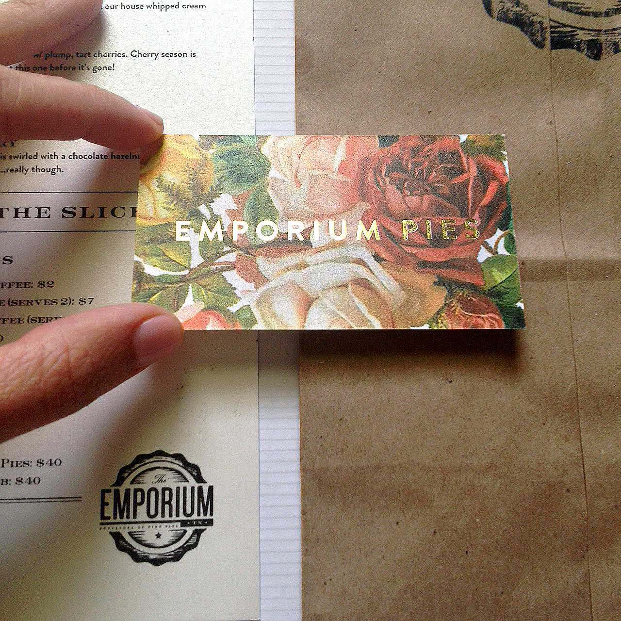
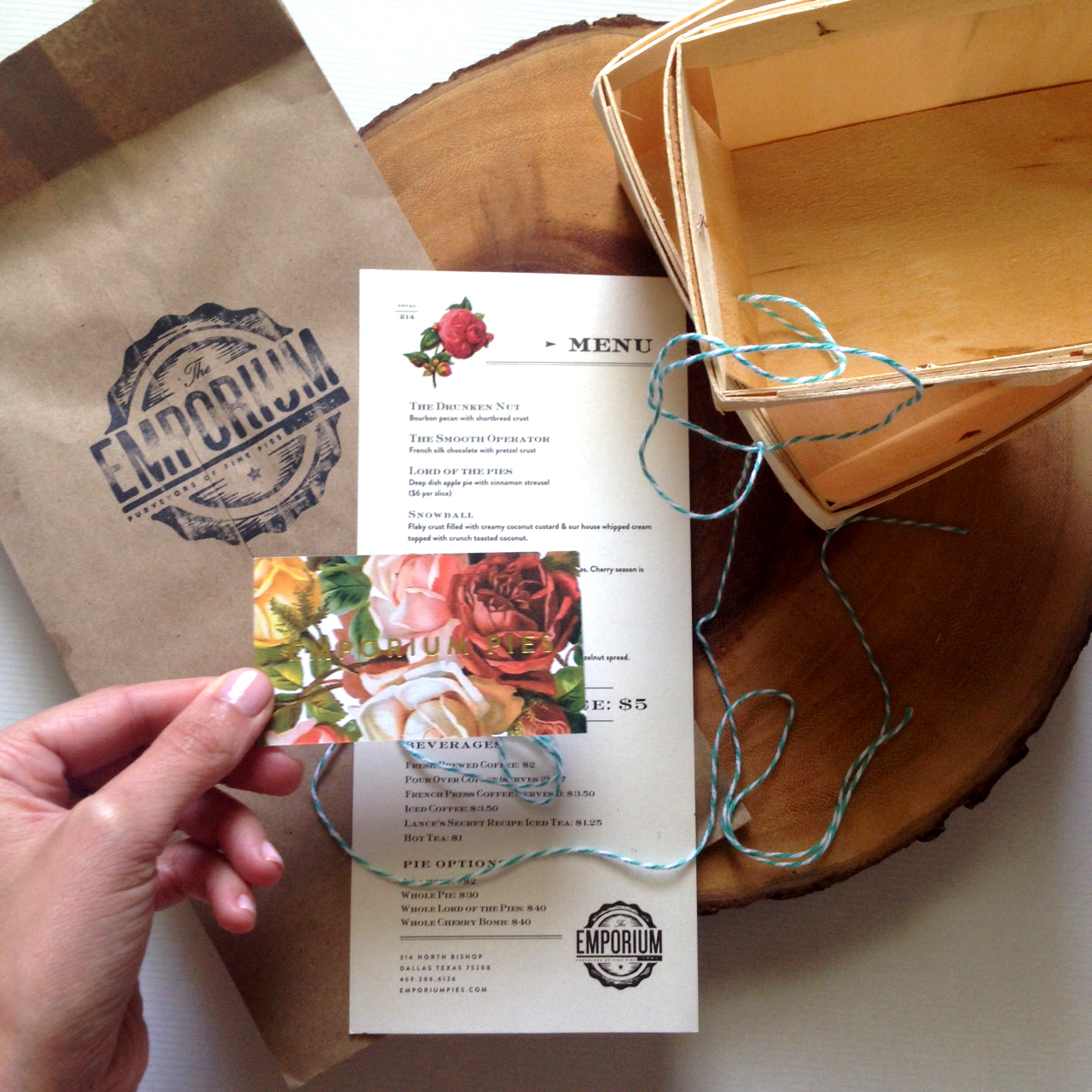
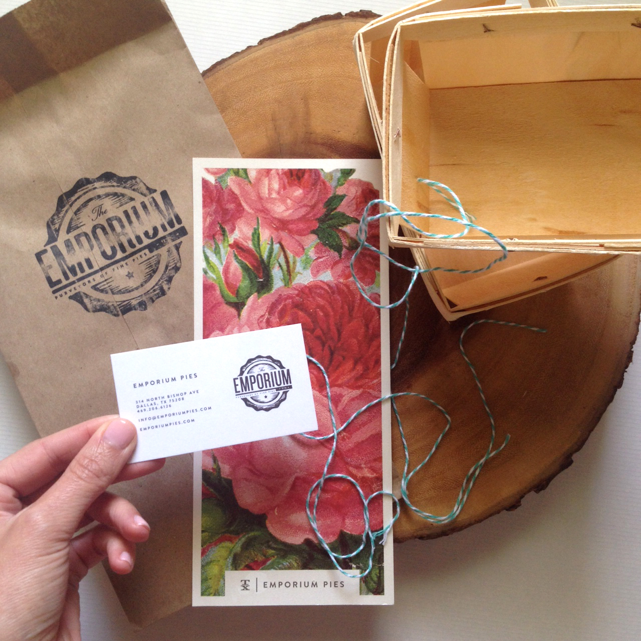
graphic design credit : Scott Hill and the Foundry Collective

A few other fun items to note :
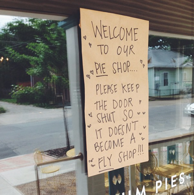
— Their hand written notes sprinkled throughout the shop are clever. When you walk onto the porch you are greeted with a little sign that says, "Welcome to our Pie Shop. Please keep the door shut, so it doesn't become a fly shop." It’s whimsical, full of personalty, and captures a bit of who these ladies are.
— The Drunken Nut pie is really good!
— The vintage art prints in the shop are beautiful.
— And lastly, if you dine in, you pretty much feel like you are sitting in someone's home,
{in the best way} down to the dishes!

Screen Shot 2015-07-13 at 12.58.59 PM.png
Screen Shot 2015-07-13 at 1.51.26 PM.png
Screen Shot 2015-07-13 at 1.56.22 PM.png

Now, don't you just want to take a road trip and snag some Emporium Pie right this instant!?
Do it!

What are some of your favorite brands that are capturing your attention? I would love to know!

longLine.jpg
tags: Logo Design, Typography, Visual Branding, Brand Identity, Small Business, Startups
categories: Graphic Design
Friday 08.07.15
Posted by Haley Gandy
 

Free Digital Download


When I sit down to create your digital graphic download each month, I ask myself "What would they want to see everyday?" What would be motivating or encouraging? What truth do we all need to remember? Since I literally stare at my computer everyday, all day...I want to enjoy my desktop, as Im sure you do to. Heading into August the phrase that kept popping into my head for this month was "new life".  After thinking about it for a while, and what would bring new life everyday, Lamentations 3:22-23 came to mind. I hope you are reminded each day this month of the new life that we have been given. Each day is a gift, full of new mercies that never run out! Even if it's a 100 degrees outside.

iphone wallpaper
desktop wallpaper
tags: Free Download
categories: Graphic Design
Monday 08.03.15
Posted by Haley Gandy
 

CLIENT STORY : No place like Home


There’s no place like home, and my client Pam Tucker knows that for a fact. Pam is a local real estate agent specializing inluxury homes. For years Pam has been helping her clients find their dream home with customer service that goes above and beyond. One of the things I respect about Pam is that she is innovative in the way she does business and markets herself, so I knew working with her was going to be a great project.

Pam’s old marketing materials didn’t represent the quality and service that she offers her clients. She was also adding a moving truck to her real estate service. This truck would be free for her clients to use as they got ready to sell and pack up their home - how genius right?!?! This natural transition in her business was the perfect time to transition her visual branding as well. It was time to get rid of the primary red and blue she had been using and introduce a fresh and updated look. We began to work together to create solid visually brand that could grow with her business.

This process was a couple months long from our first meeting until the completed wrapped truck pulled into her driveway. Since Pam works with Coldwell Banker, (a brand and logo that need to be on everything she put out there) picking the right color palette to complement that current look was extremely important. We still wanted her brand to stand alone and be unique while being able to pair great with the visual branding of Coldwell. As I was meeting with Pam at her office, I started to look around and notice a repeat of some of the same colors over and over again. Her picture frames, pillows, art and even the clothes she was wearing all had touches of gold turquoise, corals, and neutrals in them. Since we are literally branding Pam Tucker, I thought that the colors surrounding her would be a good place to start. I came up with about four different color palette options to present to Pam. Each of them had a shade of turquoise/aqua and a shade of gold which complemented the Coldwell blue.

The other key component of Pam’s rebrand was to visually communicate Pam’s specialty in the luxury housing market. Kendra Scott and Tory Burch immediately came to mind as successful business women who were in the luxury market also. Both of these women's brands are very recognizable and are well known for quality and esthetic. I began to get inspired and brainstorm how I could create something similar for Pam.

I sketched out a couple different "fancy" looking marks that could be paired with her name to communicate that luxury feel she was going for. However, Pam wanted to see an actual house or key of some kind to represent luxury homes with he rname. Listening to my client’s desires and combining them with my knowledge of marketing and graphic design is always important  to me.  In the end we decided to stick with a couple clean flourish/marks, that were not so literal and that satisfied both of us. With a finished logos, I was able to restructure new layouts of her marketing pieces (direct mailers, flyers, stationery, etc. ) to match this clean, simple, and sophisticated identity.

The moving truck had to be considered a huge billboard that was easy to read and clearly communicated Pam’s services. As a graphic designer I loved getting to work on such a fun canvas. Pam and I are both proud of how her new visual branding and marketing materials came together in the end. I look forward to seeing Pam continue to expand her business and continue to grow her brand in Central Texas!

PamTuckerLogo.jpg
PamTuckerVisualBrand.jpg
PamTuckerFliers.jpg
Brand Stationery
PamTuckerAds.jpg
PamTuckerDigtialGraphics.jpg
PamTuckerMailer.jpg
PamTuckerTruckDesign.jpg
PamTuckerTruck.jpg
PamTuckerBanners.jpg
tags: Pam Tucker, Logo Design, Outdoor Advertising
Wednesday 07.29.15
Posted by Haley Gandy
 

CLIENT STORY : Local Bridge Inspired Visual Branding


Rio Brazos has been a well established caterer for years. With a reputation and a recognized name throughout Waco and central Texas, the design challenge was not to stray too far away from what is already so known. Originally, Rio Brazos wanted a logo that said "Waco" and therefore incorporated the city's suspension bridge. However, their old logo didn't exactly represent the catering side of their company along with the idea of it being local (Waco). Through our discussions about the rebrand, incorporating the suspension bridge was still a desire of high priority for them; therefore, tying in the food aspect was going to be necessary and the challenge.  
   For me, the sketching/brainstorming process seemed like it went on for hours and days. Even without a pencil in hand, I was still drawing and playing with ideas in my head trying to feel this one out. I wanted to try and illustrate the artistic and creative thought behind how they prepare their food and menus as well as tie in their foundation of classic, traditional cuisine. The sketchy, whimsical bridge paired with the strong, clean lines of the typography coincide perfectly, just like fine ingredients complimenting each other in a delicious dish. In coming up with the colors, I had fun being inspired by classic, rich ingredients such as cream and cinnamon. When I think of classic cooking, I often think of copper pots and pans and therefore wanted to incorporate the richness of the copper foiling. 
   I am happy with the way this logo turned out and how it represents Rio Brazos Cuisine for being established in Waco and for being about the creative pallet. 

Bridge.png
tags: Logo Design, Visual Branding
Thursday 07.16.15
Posted by Haley Gandy
 

Q & A with Liz Griffin Creative


Liz Griffin, of Griffin Creative is passionate about people, growth and making change happen. She has a strategic mind for creating solutions, and big vision concepts. Liz and I have gotten to work together a bit this year on some dynamic client projects, and when two creatives (graphic designer & writer) get together and bring their insight and expertise to the table it's a win, win. Partnering together with other professionals in the same industry, or similar industries, often elevates the work created and the customer experience you are able to offer.  

Among the many creative avenues Liz finds herself involved with, one of those avenues is her newsletter "Baller Status". Once a month she will interview one of her followers, so I thought it was time to turn the mic around and interview the interviewer. Liz was kind enough to let me ask her a few questions, so lets see what the Baller herself has to say...

Screen Shot 2015-07-09 at 5.25.47 PM.png 1432843787975.jpeg Screen Shot 2015-07-09 at 5.25.09 PM.png unicorn.png Screen Shot 2015-07-09 at 5.24.18 PM.png Screen Shot 2015-07-09 at 5.20.41 PM.png Screen Shot 2015-07-09 at 5.21.16 PM.png Screen Shot 2015-07-09 at 5.25.20 PM.png

Let's start with ... your 3 second commercial - tell us who is The Liz Griffin?

I am a writer, pep talk giver, creative and justice seeker. I believe that people's imaginations are meant to change the world for good. I work with an anti-trafficking organization called UnBound and have a creative agency called The Griffin Creative. In addition to that I write over at thelizgriffin.com. Coffee is my drug of choice, London is my favorite city and unicorns are one of my favorite things. Not cats though. I really don't like cats very much.

How would you describe "abolitionist" and "ideation strategist" to second graders?

I would describe an abolitionist as someone who works for the rights and freedoms of others. And I'd have to explain an ideation strategist as a person who comes up with ideas and ways to make them happen.

In your field, what 2 or 3 things would you consider to be your expertise?

Oh gosh. Well I guess it would be brand strategy and messaging. I love working with people to create a clear identity and path of growth for their business or project.  Messaging would probably be my main area of expertise. Words are my jam and stringing them together to create the right message for the target audience is my favorite thing I do. 

What is your favorite meal to cook for your family?

My favorite meal to cook for my family has to be maple roasted chicken, sweet potatoes and fruit salad. Hands down.

Being out in the creative work force as a self-employed entrepreneur, what is your strategy for making the "thing you do" an actual business and not just a hobby or a good idea? 

Over time my strategy has shifted as I really narrowed what the "thing I do" is. Growth is a very important thing to leave room for. Each time I decide to take a step forward in my career I try it out for awhile as a hobby and see if I am actually good at it. Plus getting experience doing it gives me time to clarify exactly what it is I am wanting to build. Having like-minded people around me that are also entrepreneurs is really valuable too. A community of people who are aiming for the same things have been a constant source of help. I tend to "soft launch" my idea and then get that community's feedback. It has saved me lots of time and money getting as much clarity on the front end as possible. I think that is the reason most people stay stuck in the "dreaming" stage. They have ideas but not enough clarity to act. Trouble is usually you don't get that needed clarity until you kind of test drive the idea for a while. 

What are 3 of your favorite books?

Love Does by Bob Goff
If You Find This Letter by Hannah Brencher
The Portrait of Dorian Gray by Oscar Wilde

At the end of the day what 5 things matter to you?

Oh gosh. Thats hard to narrow down. Guess it would be : 
- growing closer to God
- loving my family well
- influencing my generation
- living bravely
- helping people in a profound way

Most of us gleam from the wisdom and advice from those who have gone ahead. Among many things, YOU HAVE :  
• lived in a couple different cultures

• had to pioneer hard ground to start different ventures out of nothing
• children of your own, and are in the process of adopting
• started your own business and still make time for rich community
• you have stayed on top of and in-tune to the global, technical, and  
  relational world around you...


What gives? What bit of wisdom or advice can you share?

What gives? I guess I am a bit insane!  I started traveling the world in kindergarten and have been blessed to hear the stories of people in over twenty nations. I think when you engage the "bigger picture" in that way it allows you to see what really matters to you. I aim to accomplish a lot in my life and that means that I say "no" to a lot of things. I don't go to every social event or participate in every professional opportunity. I am very focused on who I want to become as a person and as a business. Plus, I don't believe in being insanely busy. If I don't have time to enjoy the life I am living, then I need to cut things out. So my advice would be to decide what really matters and not give in the the pressure to do or be more than that. Fight for clarity in your relationships and goals both. But always say "yes" to impromptu road trips. Those are the best.


tags: Create, entrepreneurs, Design, Waco, Texas
categories: Create
Friday 07.10.15
Posted by Haley Gandy
 

A Beautiful Resource with Gold Foil


The inaugural volume of The Kindred. We wondered if it was possible to create  something so lovely in such a small city. Thank you for helping us exceed people’s  expectations of the level of beauty this town can create. With this book we are hoping to provide the ultimate resource for Waco weddings and events. The best of the best.  Thoughtfulness, integrity, and unleashed creativity was poured into each page of this book. In our industry, there is nothing like a referral from someone in the know. We consider The Kindred to be the loveliest version of “word of mouth”. We give this book to each of our clients and the other members of the Kindred do the same. Our goal is to not simply refer each other but also to build community within the event industry.

TheKindredLogo.jpg
Publication Design Cedar Gandy
TheKindredBranding.jpg
Vol 1
SwagBag
LaunchParty1
TheKindred5.jpg
LanuchPary2
CedarGandyWork
tags: The Kindred, Logo Design, Collaboration, Publication Layout, Visual Branding
Wednesday 07.08.15
Posted by Haley Gandy
 

CLIENT STORY : Inspired to Action Day Planner


When Kat Lee of Inspired to Action and I sat down to talk about the planner she wanted to create, the words she used were sophisticated, beautiful, easy to use, but not too "pretty". She said, "You know how sometimes something is so pretty you don't want to use it, or write on it because you think you'll mess up?... I don't want the planner to feel like that, I want it to feel approachable and classy. I want the designs to look excellent. Moms deserve high quality resources that truly help them to grow. I want them to feel more organized and purposeful just by picking up the planner." She showed me some of her sketched layouts, and we jumped in. 

As I do with all my clients, I put together a couple mood boards in order to get some feedback from Kat before starting down the design road. I have found that this is key, and a time saver. Research, Research, Research. Although Kat told me she wanted a sophisticated, beautiful, classic design, those words may look and feel a specific way to me that differs from the way she views them. Therefor going the extra mile, to communicate via mood boards and research is worth it. Once I had shown Kat the boards, and we picked a direction, I laid out a couple pages for her to review, and SNAP, they were approved - so off I went to design the other 60. 

What is so neat about The Inspired To Action Planner is, it's more than just a calendar. It’s a complete system designed to help make the most of each and every moment. 

Kat's goal for this planner was to lead her costumers to ;
- Learn to identify their goals
- Break those goals down into projects
- Understand how much time they REALLY have
- Determine how long tasks REALLY take
- Learn to eliminate "the overwhelm"
- And Get things done!

With the experience and expertise Kat offers in this area, and the design skills I was able to bring to the table, we were able to create a gorgeous, yet useful resource, that we are both proud of. 

Logo.jpg
BrandingElements.jpg
2.jpg
Designed Planner Pages
Designer Planner Kit
Monday 07.06.15
Posted by Haley Gandy
 

Your Company Logo


Your logo is not your brand.
Your logo is not your identity.
Your logo identities your company in it’s simplest form, and what your logo means is important.

Here are a few helpful questions I ask my clients.

> What is your companies mission and vision?
> What words best describe your business?
> What do you want your logo and the elements we create to say about you and your business?  
   What does it need to communicate to your audience?  

tags: Graphic Design, Logo Design, Waco, Texas, Brand Identity, Visual Branding
Friday 07.03.15
Posted by Haley Gandy
 
Newer / Older

Copyright © 2014-2023 Cedar Gandy   |   All Rights Reserved